Written By Divya
Published By: Divya | Published: Dec 15, 2025, 02:47 PM (IST)
Written By Divya
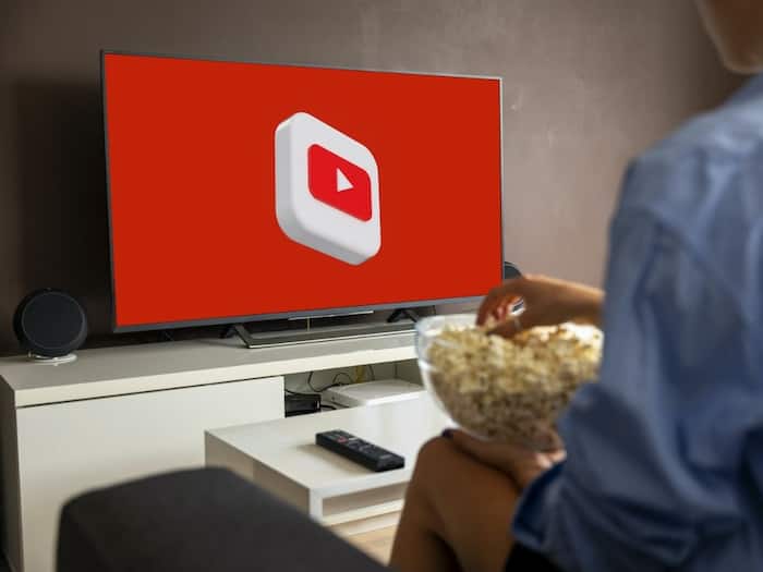
YouTube is quietly rolling out a refreshed interface for its TV app, and while it may not look dramatically different at first glance, the changes are clearly aimed at one thing – making YouTube easier to use on a big screen with a remote in hand. ![]() Also Read: Meta will pay creators up to Rs 2.7 lakh to post on Facebook; Here's why
Also Read: Meta will pay creators up to Rs 2.7 lakh to post on Facebook; Here's why
The updated TV interface was first teased earlier this year and is now starting to appear on devices like Google TV streamers and Apple TV. Instead of a full redesign, YouTube has focused on cleaning up the screen, reducing clutter, and bringing frequently used controls within easier reach. What’s new with the design? Know all the details here. ![]() Also Read: FIFA’s new YouTube deal could change how fans watch the 2026 World Cup
Also Read: FIFA’s new YouTube deal could change how fans watch the 2026 World Cup
One of the first things you will notice is where the video title now lives. Instead of sitting inside the main player interface, the title has been moved to the top-left corner of the screen. It’s no longer clickable, which might sound limiting, but the idea here is simple – keep the video front and centre without extra overlays. ![]() Also Read: ‘Instagram is a drug’: US jury set to decide in social media addiction trial
Also Read: ‘Instagram is a drug’: US jury set to decide in social media addiction trial
To balance that change, YouTube has introduced a new Description button. Tapping this opens a dedicated panel that includes the video description, creator details, and comments, all in one place. This keeps the main playback screen cleaner while still making information accessible.
The biggest improvement comes in how playback controls are organised. Buttons are now grouped neatly under the scrubber bar into three sections, making navigation smoother when using a TV remote.
Left side: Channel name, Description button, and Subscribe
Centre: Previous video, Play/Pause, and Next video
Right side: Like, Dislike, Comment, Save, Closed Captions, and Settings
This layout feels more in line with traditional streaming apps and reduces the need to jump across menus mid-watch.
Another small tweak is the always-visible Subscribe button. It now stays on screen and adapts based on the content. Some of you may also see additional features depending on the content. Live sports streams can show a Multiview option, while YouTube Premium and YouTube Music subscribers get a Display Mode setting for better visual customisation.
YouTube says the update is designed to make everyday TV viewing simpler, not to reinvent the app entirely. The rollout appears to be gradual, so not everyone will see the new interface immediately. But if you watch YouTube regularly on a smart TV, this update should make the experience feel a bit more polished and less busy.
Don't Miss Out the Latest Updates. Subscribe to Our Newsletter Today!