Written By Madhav Malhotra
Published By: Madhav Malhotra | Published: May 17, 2025, 02:45 PM (IST)

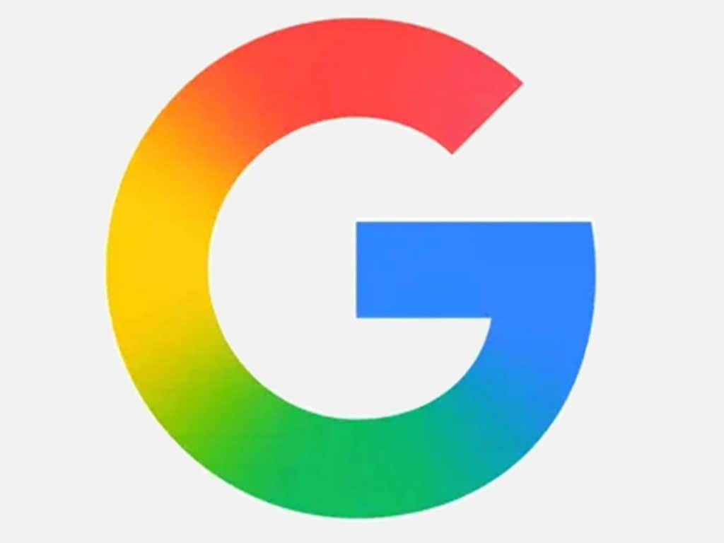
After a decade of using the same segmented four-color “G” logo, Google is finally switching things up. The tech giant’s iconic emblem is getting a fresh makeover, now featuring a smooth rainbow gradient instead of the traditional blocks of red, yellow, green, and blue. The most exciting part is it won’t be limited to just the Google app and could appear across all Google apps found on Android phones. Also Read: Google Gemini Arrives On Android Auto For Real-Time Conversations And Live Translation
This new look was first spotted on iOS and later in Android beta builds. But now, the soft and subtle multi-hued gradient has even made its way to the Play Store. Interestingly, Google hasn’t officially said a word about this redesign—no blog post, no announcement, no press release. It seems they’re going for a quiet rollout, avoiding any major hype or buzz around the refresh. Also Read: Google Adds Search Live to AI Mode for Real-Time Voice Chats

Also Read: Google I/O 2025: Here’s Everything Google Announced from Gemini 2.5 Pro to Android XR
Right now, the glowing new G appears to be limited to the Google app icon, and there’s no confirmation yet on whether the company plans to extend the new gradient style to other services like Gmail, Maps, or Chrome. That said, it’s likely we’ll start seeing a silent shift as Google moves to unify the branding across all its apps.
The timing of this shift seems intentional, with Google I/O 2025 kicking off on May 20. This low-key rollout might be a subtle teaser for a broader branding refresh. Google could be planning to say goodbye to the old-school color blocks and embrace a more modern design, featuring a smooth, blended gradient that reflects a new era of visual identity.