
Written By Deepti Ratnam
Published By: Deepti Ratnam | Published: Jan 20, 2026, 08:44 AM (IST)
Written By Deepti Ratnam
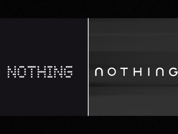
Nothing, a leading smartphone manufacturer and tech giant, has announced a significant rebranding of its brand image by posting a totally new logo on social media. The tech giant posted a bold and unconventional design strategy, strongly hinting that the company is outgrowing the pixel-like logo. To recall, the company’s Pixel-like logo has characterized the brand since the beginning and makes it stand out in terms of its ideology and what they want to bring to the technology world. Although the teaser doesn’t reveal much, however, it obviously hints at a new direction and a new step that the brand is taking in Nothing’s journey.
Nothing posted new logo on its social media and X (formerly Twitter) with a less messy and more classic typographic style. It is a noticeable departure of the company’s earlier dot-matrix style and pixel based design language that made the brand instantly recognizable. The company complemented the images with the statement of getting ready to make history, which shows that this change is not a mere update.
Nevertheless, Nothing is yet to clarify anything regarding the new design. Not only this, there is no confirmation as to how much this new logo will be applicable in company’s whole aesthetic. Is it going to be limited to the logo alone or is applicable to the branding as a whole.
Nothing has positioned itself as a design-led tech company that always comes up with something daring. One of the essential and striking contributions in maintaining this identity is the pixel-logo. Leaving this identity means that company is planning to have a more international presence and requires more multipurpose image. The plan of coming up with a new image can be applied to not just products, but platforms and markets too.
This change may also help unify branding across its growing product lineup, including smartphones, audio devices, and its CMF sub-brand.
As anticipated, the teased logo has divided the internet. It is viewed as a natural development by some users and the brand should grow visually as it does. Some believe that the new appearance has the potential to lose the distinctive nature that made Nothing shine among the rest of the technology.
The similarity between the new wordmark and Jaguar logo was also mentioned by a number of users, which introduced additional controversy. Nothing is yet to announce the official rollout date of the new logo as well as the time it will be officially unveiled by the company on its platforms. One cannot see even the slightest trace of upcoming product releases or events related to this teaser.
Don't Miss Out the Latest Updates. Subscribe to Our Newsletter Today!